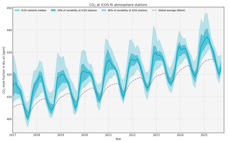
The interactive ICOS curve above shows the change in CO2 concentrations in the atmosphere above Europe over time. The Curve uses observation data from 38 ICOS Atmosphere stations in Europe. It shows the median from these stations as a thick line and the differences between the stations as coloured areas. The ICOS Curve enables an easy way to see the greenhouse gas concentrations from different parts of Europe in the same picture. The data is updated daily, giving recent information on CO2 concentrations and trends. On the ICOS Curve tool at curve.icos-ri.eu, you can select one or several stations, visualise the data and compare the stations to the median of all ICOS stations, each other or to global averages. The ICOS Curve tool at curve.icos-ri.eu also has Methane and Nitrous Oxide curves in addition to the Carbon Dioxide visualisation.
Learn how to use the interactive tool and what it actually shows.
Use the interactive tool without further explanations.